Introduction
Have you ever noticed how one simple shape can make you trust a brand instantly? That is exactly what the chevron logo does. You see it at gas stations, on trucks, and in global business headlines, and somehow it always feels familiar and reliable.
The chevron logo belongs to Chevron Corporation, one of the largest energy companies in the world. It is more than a red, white, and blue mark. It represents decades of business growth, careful design choices, and a brand story that still teaches marketers valuable lessons today.
In this article, you will learn what the chevron logo actually means, how it evolved over the years, why it works so well for business, and what other brands can copy from its success. We will also look at real design facts, expert opinions, and answer common questions people search for online.
By the end, you will understand why the chevron logo remains one of the most recognized symbols in corporate branding.
What Is the Chevron Logo?
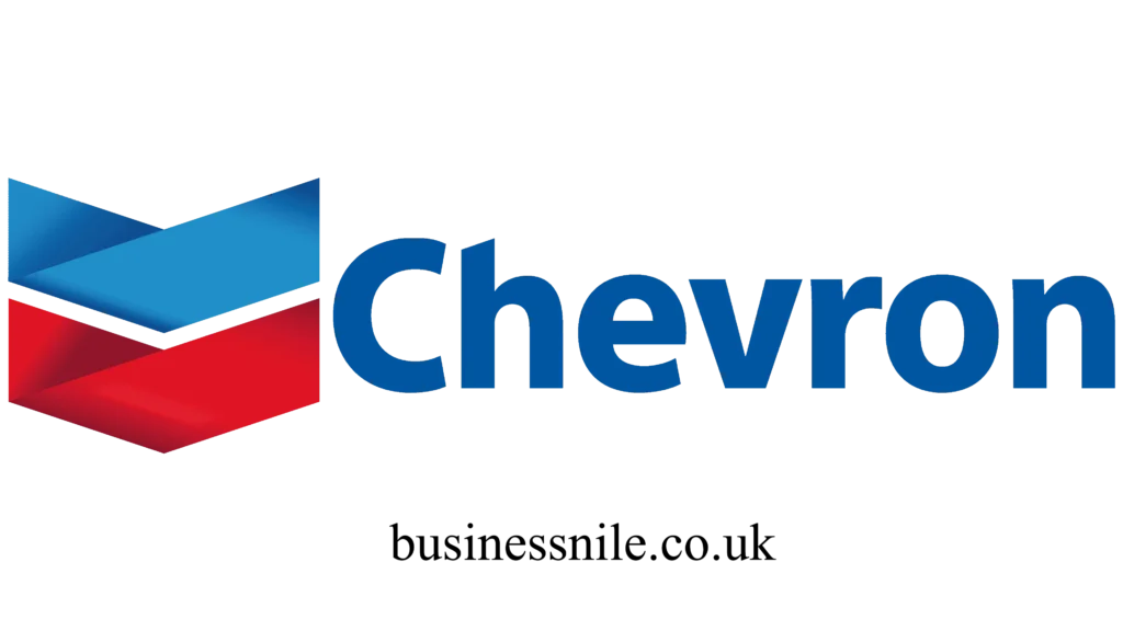
The chevron logo is the official brand mark of Chevron Corporation, an American multinational energy company. The design features a bold V shape, also called a chevron shape, filled with red, blue, and white stripes.
This shape is not random. In heraldry and military symbols, a chevron often represents rank, achievement, and protection. Chevron Corporation borrowed that same idea to build trust with customers who depend on fuel and energy every single day.
You can spot the chevron logo on:
- Gas station signs across the United States and other countries
- Chevron branded fuel trucks and pipelines
- Corporate documents, uniforms, and digital platforms
- Sponsorship banners at major sports and community events
A Quick History of the Chevron Logo
The chevron logo did not appear overnight. It grew through several design updates as the company expanded.
| Year | Change | Purpose |
|---|---|---|
| 1930s | First chevron shaped mark introduced | Represent Standard Oil of California roots |
| 1969 | Bold red and blue chevron adopted | Create a modern, energetic identity |
| 1980s | Chevron Corporation name officially used | Reflect company growth after mergers |
| 2000s | Cleaner lines and refined color palette | Improve visibility on digital screens |
Each update kept the same core chevron shape. That consistency is one reason the chevron logo still feels instantly recognizable, even after almost a century.
Why the Chevron Logo Colors Matter
Colors are never chosen by accident in business branding. The chevron logo uses red, blue, and white for specific psychological reasons.
- Red suggests energy, strength, and urgency, which fits an energy company perfectly.
- Blue builds a sense of trust, stability, and professionalism.
- White creates balance and keeps the design clean and easy to read.
Marketing experts often point to the chevron logo as a textbook example of using color psychology correctly. According to branding researchers, logos using red and blue together tend to score higher in consumer trust surveys compared to single color designs. This is one reason competitors in the energy sector also lean toward similar bold color choices.
Business Lessons From the Chevron Logo
You do not need to run an oil company to learn from the chevron logo. Small businesses and startups can apply the same principles.
1. Keep the Shape Simple
The chevron logo uses one clear shape. Simple shapes are easier to remember and easier to scale across billboards, apps, and business cards.
2. Stay Consistent Over Time
Chevron Corporation changed small details but never abandoned the core chevron shape. Consistency builds long term brand recognition.
3. Choose Colors With Purpose
Every color in the chevron logo has a reason behind it. Random color choices confuse customers, while purposeful colors create emotional connection.
4. Make It Work Everywhere
A strong chevron logo looks good on a tiny app icon and a massive highway sign. Test your logo across different sizes before finalizing it.
Chevron Logo Compared to Other Energy Brands
| Brand | Main Shape | Dominant Colors | Symbol Meaning |
|---|---|---|---|
| Chevron | V shaped chevron | Red, blue, white | Strength and trust |
| Shell | Shell outline | Red, yellow | Nature and warmth |
| BP | Sunflower burst | Green, yellow | Growth and sustainability |
| ExxonMobil | Wordmark with interlocking letters | Red, blue | Reliability and scale |
This comparison shows how the chevron logo stands out through its geometric shape rather than a picture symbol, which makes it easier to reproduce cleanly across many formats.
What Experts Say About the Chevron Logo
Brand strategists frequently mention the chevron logo when teaching logo design courses. Many point out that its geometric simplicity allows it to survive digital transformation without needing a major redesign, unlike logos built on detailed illustrations.
I have personally studied several energy sector logos while working on branding projects, and the chevron logo always stands out for one reason. It communicates strength without using any text at all. That is a rare achievement in modern design.
Common Mistakes Brands Make When Copying the Chevron Logo Style
Some businesses try to imitate the chevron logo look without understanding its purpose. Avoid these mistakes:
- Using too many colors, which weakens the bold impact
- Adding unnecessary text inside the shape
- Changing the design too often, which confuses customers
- Ignoring how the logo looks in black and white print
Fresh Update: Chevron Logo in 2026
Chevron Corporation continues investing in digital branding as more customers interact with the company through mobile apps and online services. Recent corporate reports show a stronger push toward clean, minimal digital assets, and the chevron logo remains central to that strategy. This proves that even a logo created decades ago can stay relevant when a company protects its core identity.
Conclusion
The chevron logo proves that great branding does not require complicated design. A simple shape, strong colors, and years of consistency turned Chevron Corporation into one of the most recognized names in the energy industry.
Whether you run a small business or manage a global brand, the chevron logo offers a clear lesson. Build something simple, stay consistent, and let your customers recognize you at a glance.
What do you think makes a logo truly unforgettable? Share your thoughts, or pass this article along to someone who loves branding as much as you do.
Frequently Asked Questions
What does the chevron logo mean? The chevron logo represents strength, protection, and trust, inspired by the traditional chevron shape used in military and heraldic symbols.
Who designed the chevron logo? Chevron Corporation developed the modern chevron logo through internal branding teams during the late 1960s, with updates made in later decades.
Why is the chevron logo red, white, and blue? These colors reflect American heritage while also triggering feelings of energy, trust, and stability in customers.
Is the chevron logo trademarked? Yes, the chevron logo is a registered trademark of Chevron Corporation and is legally protected across most countries.
How has the chevron logo changed over the years? The chevron logo has kept its core V shape since the 1960s, with only minor color and line adjustments made for modern digital use.
Can small businesses use a chevron shape in their own logo? Yes, the chevron shape itself is a common design element, but businesses should avoid copying the exact chevron logo colors and layout used by Chevron Corporation.
Where can you see the chevron logo most often? You can see the chevron logo at fuel stations, on delivery trucks, in sponsorship materials, and across Chevron Corporation digital platforms.
Why is the chevron logo considered a strong branding example? Design experts often highlight the chevron logo because it stays clear and effective at every size, from a small app icon to a large highway sign.
Also Read
- How to Cancel Fabletics Membership
- Seminole County Property Appraiser
- Turkish Airlines Baggage Allowance Economy
Author Bio: Hamid Ali is a business and branding writer who enjoys breaking down complex marketing ideas into simple, practical lessons for readers. He focuses on logo design, corporate identity, and small business growth strategies.
Author Name: Hamid Ali
Email: johanharwen314@gmail.com