A business card gets about two seconds of attention before someone decides whether to keep it or toss it. The cards that survive usually do one of two things: they feel distinctive in the hand, or they make the next step (calling, visiting a site, saving a contact) effortless. This guide covers ideas that achieve both, along with the design and printing decisions that determine whether a card looks professional or forgettable.
What makes a business card unique?
A unique business card is one whose design, material, or function reflects the brand and gives the recipient a reason to keep it. Novelty alone isn’t enough. A die-cut card shaped like a tooth means something for a dentist and nothing for an accountant.
Three qualities separate memorable cards from generic ones:
- Relevance: the format connects to what you do.
- Tactile quality: weight, texture, and finish shape the first impression and, with it, how much a stranger trusts you.
- Usability: the contact information is readable at a glance and easy to act on.
In my experience reviewing card designs, the most common failure is over-design. Heavy finishes on a cluttered layout look worse than a plain card with strong typography.
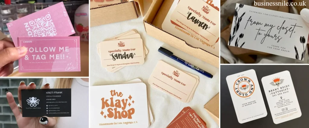
Creative business card ideas
Minimalist business cards
Minimalist cards use whitespace, one typeface, and only essential details. They suit consultants, architects, lawyers, and anyone selling credibility over personality. A white or off-white stock with a single accent color feels confident. Cut anything the recipient doesn’t need: a second phone number, a slogan, a stock icon.
Colorful business cards
Bold color works when it’s tied to your brand colors rather than chosen at random. A saturated full-bleed background, a color-blocked back, or an edge-painted border all make a stack of cards easy to spot. Keep text contrast high: dark navy blue on white or white on a deep color holds up far better than mid-tone pairings.
Square business cards
A square format breaks from the standard rectangle without the cost of a custom shape. It suits photographers, designers, and boutique brands. The caveat is practical: square cards may not fit standard card holders and wallets, so confirm that’s an acceptable trade-off for your audience.
Foldable business cards
Folding gives you roughly twice the space, useful for a short service menu, a map, or a mini portfolio. Keep the outer face clean (name, logo) and put detail inside. Avoid folding for cards meant to be handed out in bulk, since thickness adds up in a pocket.
Transparent business cards
Clear plastic cards are striking for glass, lighting, and tech businesses. Their weakness is readability: text on a transparent surface can disappear against some backgrounds, so many designers add a white ink layer behind key details. Always request a proof.
Die-cut business cards
Die-cutting trims the card into a custom shape, or cuts a window through it. It’s the strongest way to make a physical object that echoes your logo. Simple shapes (rounded corners, a notch, a single cutout) print more reliably and cost less than intricate outlines.
Foil business cards
A foil finish applies a thin metallic layer, usually gold, silver, or rose gold, to specific elements like a logo. It pairs especially well with black business cards, where the metallic detail catches light. Use foil sparingly on one element; covering the whole card reduces legibility.
Raised UV business cards
Spot UV adds a glossy, slightly raised coating to chosen areas, typically over a matte surface. The contrast between matte and gloss creates depth, and it works well on a logo or pattern. It’s a good middle ground between a plain card and a fully custom build.
Business cards with unique materials
Material is often the fastest route to a premium feel:
- Textured paper (linen, cotton, felt) adds warmth.
- Eco-friendly paper (recycled or tree-free stocks) signals environmental values, which suits sustainable brands.
- Wood, metal, or plastic make a strong statement but cost more and may be harder to write on.
Industry-specific business cards
Tailor the idea to the trade. A real estate agent might add a headshot and a QR code to listings. A chef could use a recipe-card layout. A florist might print on seeded paper. The test is simple: would someone in your industry smile when they received it?
Business cards with QR codes
A QR code turns a static card into a gateway to your portfolio, booking page, or contact file. For best results:
- Use a dynamic code from a reputable QR code generator so you can change the destination without reprinting.
- Print it at roughly 0.8 inch (2 cm) square or larger, with clear space around it.
- Test it on several phones before ordering.
- Link to a mobile-friendly page, not a generic homepage.
Physical or digital: where does a business card fit in 2026?
Digital business cards, shared by link, QR code, or NFC tap, are now common, and apps such as HiHello and Linq let you update details instantly. They don’t replace the physical card so much as complement it. A printed card remains useful where a phone is awkward or impersonal, such as trade shows, in-person sales calls, and local services. A practical hybrid is a physical card with an NFC chip or QR code that opens your digital profile.
How to design a memorable business card
Choose the right size and shape
The standard US business card is 3.5 × 2 inches, which fits wallets and holders everywhere. Anything else is a deliberate trade-off. Pick between:
- Horizontal layout: the default, familiar, and easiest to read.
- Vertical layout: distinctive and good for a name-forward design, but less common in holders.
- Custom shape: memorable, but costlier and sometimes impractical.
Use your logo and brand colors
Consistency drives brand recognition. Place your logo where the eye lands first, and pull your palette from your existing branding so the card matches your website and signage. Limit yourself to two or three colors. If your logo design is weak or low-resolution, fix that before printing; a card exposes flaws immediately.
Get typography and layout right
Typography does most of the work in a professional design. Use a maximum of two typefaces, keep body text at around 8 pt or larger, and put your name and title at the top of the hierarchy. A clean business card layout follows a predictable reading order: name, role, then contact details. Include only what people will actually use: phone, email, website, and perhaps one social profile or QR code. Leave the back blank, use it for a second language or booking link, or reserve it for notes. A blank back is often a quiet advantage.
Use templates and AI tools wisely
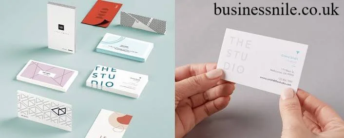
Templates from Canva, Adobe Express, or printers like Vistaprint and MOO are a fast starting point. AI design tools can generate layout options and color pairings in seconds, but they tend to produce similar-looking results. Treat them as a draft, then adjust spacing, hierarchy, and wording yourself so the card doesn’t look like everyone else’s.
Business card printing tips
Good print quality depends on file setup as much as on the printer. Before you order:
- Work at 300 DPI or higher, and use vector artwork for logos where possible.
- Add bleed (commonly 0.125 inch) and keep important text inside the safe margin.
- Convert files to CMYK so colors match print rather than screen. Rich blacks and bright blues often shift.
- Choose paper weight deliberately. Thicker stock feels more substantial, but extremely heavy cards may not suit every card holder.
- Order a proof or sample pack when using foil, spot UV, or unusual materials.
- Proofread twice. Phone numbers and email addresses are the most expensive typos.
| Finish | Look and feel | Best for | Watch out for |
|---|---|---|---|
| Matte | Soft, modern, easy to write on | Minimalist, professional cards | Can show scuffs on dark colors |
| Gloss | Shiny, vivid color | Photos, bright palettes | Fingerprints, hard to write on |
| Foil | Metallic accent | Logos, luxury branding | Costs more; best used on small areas |
| Spot UV | Glossy raised detail on matte | Depth and contrast | Needs precise artwork |
| Textured | Tactile, premium feel | Creative and boutique brands | Fine text may lose sharpness |
Final tips for a standout business card
- Decide what action you want the card to prompt, then design toward it.
- One memorable feature beats five competing ones.
- Keep contrast and readability above all else.
- Match the card to your brand, not to a trend.
- Mock it up on screen, then print a small test batch before committing to a large run.
Strong business cards don’t need to be expensive. They need to look like you, read easily, and make it simple for someone to reach you.
Frequently Asked Questions
What makes a business card unique?
A unique card combines a distinctive design, material, or format with a clear tie to your brand. Relevance and readability matter more than novelty.
What size should a business card be?
In the US, the standard size is 3.5 × 2 inches, which fits most wallets and card holders. Square, vertical, and custom-shaped cards are available but may be harder to store.
Are QR codes on business cards worth it?
Yes, when the code links to something useful, such as a portfolio, booking page, or contact file. Use a dynamic QR code, print it large enough to scan easily, and test it before printing.
Which business card finishes look most premium?
Foil, spot UV, and textured paper are among the most popular premium options. Using one finish on one element, such as the logo, usually looks better than combining several.
Should I use a physical or digital business card?
Many professionals use both. A printed card works well for in-person networking, while a digital card (shared by link or NFC) is easy to update. A card with an NFC chip or QR code can connect the two.
What should I check before printing business cards?
Confirm 300 DPI artwork, bleed and safe margins, CMYK color mode, and accurate contact details. For special finishes, order a proof first.
Author Bio: Hamid Ali is a business and marketing writer covering branding, digital marketing, SEO, and practical business strategies. His work focuses on clear, actionable insights that help professionals and small businesses build stronger brands and grow online.
Author Name: Hamid Ali
Email: johanharwen314@gmail.com
Also Read: