Morgan Stanley Logo: Powerful Symbol of Trust, Not Just Branding In 2026


Introduction
If you have ever glanced at a financial report or walked past a Wall Street office, you have probably seen the Morgan Stanley logo. It looks simple at first glance. But that simplicity is exactly what makes it work so well.
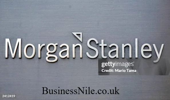
The Morgan Stanley logo is a black serif wordmark that spells out the company name in a clean, professional font. There is no icon, no emblem, no flashy symbol next to it. Just the name, styled in a way that feels timeless and trustworthy. It represents one of the world’s leading investment banks and financial services firms, and the design reflects the values the company wants you to associate with it: stability, professionalism, and global leadership in finance.
In this article, I will walk you through everything you need to know about the Morgan Stanley logo. We will cover its design elements, its history, common questions people search for, and where you can find official versions of it. By the end, you will understand not just what the logo looks like, but why it looks that way.
What Is the Morgan Stanley Logo?
The Morgan Stanley logo is the official brand mark of Morgan Stanley, a U.S. based global investment bank and financial services company headquartered in New York City. The company was founded in 1935, and over the decades it has grown into one of the most recognized names in global finance.
Unlike many corporate logos that rely on symbols or icons, the Morgan Stanley logo relies purely on typography. This is a deliberate branding choice. When a company is confident in its name and reputation, it often chooses a wordmark instead of a symbol. Think of it as a signature rather than a badge. The Morgan Stanley logo works the same way.
Breaking Down the Design of the Morgan Stanley Logo
Let’s look closely at what makes this logo instantly recognizable, even without any graphic element attached to it.
Black Serif Wordmark
The logo uses a black serif font for the company name. Serif fonts have small lines or strokes attached to the ends of letters. These fonts are often associated with tradition, reliability, and authority, which fits perfectly with a financial institution that has been around for nearly a century.
The color choice matters too. Black is a strong, neutral color. It does not compete for attention. It simply states the name with confidence.
Minimalist and Professional Appearance
The overall look of the Morgan Stanley logo is minimalist. There are no extra design elements, no gradients, and no decorative flourishes. Every part of the design serves a purpose.
This minimalism sends a clear message. In the financial world, clients want to feel that their money is in safe, steady hands. A cluttered or trendy logo could actually work against that goal. The clean design of the Morgan Stanley logo supports the brand’s image of being serious, dependable, and focused.
No Icon or Emblem
Many companies use a small icon alongside their name, think of the apple on Apple products or the swoosh on Nike gear. Morgan Stanley chose a different path. The Morgan Stanley logo has no separate icon or emblem attached to the wordmark.
This choice reinforces the idea that the name itself is the brand. After decades of building trust in global markets, Morgan Stanley does not need a symbol to be recognized. The name alone carries enough weight.
The Brand Identity Behind the Morgan Stanley Logo
A logo is never just a design choice. It is a visual summary of what a company stands for. Here is what the Morgan Stanley logo communicates to the world.
- Trust: The clean, no nonsense design tells clients their assets are handled responsibly.
- Professionalism: The serif font and black color scheme feel formal and serious.
- Stability: A logo that has stayed mostly consistent over the years suggests a company that does not chase trends.
- Global financial leadership: The simplicity of the design allows it to work across cultures and languages without losing meaning.
I find it interesting how much a company can say without saying much at all. The Morgan Stanley logo is proof that restraint can be a powerful branding tool.
Has the Morgan Stanley Logo Changed Over Time?
Yes, but not drastically. Morgan Stanley has refined its logo over the years, mostly through subtle updates to the font style and spacing rather than a complete redesign. The core idea, a black serif wordmark with no icon, has remained the same for a long time.
This kind of consistency is common among long established financial institutions. Frequent logo changes can confuse customers and dilute brand recognition. By keeping the design largely unchanged, Morgan Stanley protects decades of built up trust and familiarity.
Logo Formats People Commonly Search For
If you need the Morgan Stanley logo for a specific purpose, you have likely searched for one of these formats.
- PNG: A common choice for digital use where you need a transparent background.
- SVG: A vector format that scales without losing quality, useful for websites and apps.
- Vector files: Ideal for print materials since they stay sharp at any size.
- Transparent background: Needed when placing the logo over images or colored backgrounds.
Keep in mind that these formats are typically reserved for approved use cases like press coverage, academic work, or official partnerships. Using the Morgan Stanley logo for commercial projects without permission can raise legal issues, which we will cover next.
Is the Morgan Stanley Logo Trademarked?
Yes, the Morgan Stanley logo is a registered trademark. This means the design, along with the company name and related branding elements, is legally protected. Unauthorized use, especially for commercial purposes, can lead to legal consequences.
Trademark protection exists to prevent confusion in the marketplace. It stops other companies from using a similar design to mislead customers into thinking they are dealing with Morgan Stanley when they are not. If you plan to use the logo for anything beyond personal or editorial reference, it is best to review the official usage guidelines first or reach out directly to the company.
Where Can You Find the Official Morgan Stanley Logo?
The safest place to find the official Morgan Stanley logo is directly on the company’s official website, particularly in its media or press resources section. Official sources ensure you are getting the correct colors, proportions, and file quality.
Avoid downloading logos from random third party sites, since these versions are often outdated, low quality, or incorrectly modified. If you are working on a project that requires the Morgan Stanley logo, always trace it back to an official or verified source.
Quick Recap
The Morgan Stanley logo might look simple, but every part of it is intentional. The black serif wordmark, the lack of an icon, and the minimalist style all work together to represent trust, professionalism, and stability. It is a strong example of how a company can build a powerful visual identity without relying on flashy symbols.
Next time you spot the Morgan Stanley logo, you will notice more than just text. You will see decades of brand strategy packed into a few clean letters.
Have you come across the Morgan Stanley logo in a report, an ad, or an office building? Feel free to share your thoughts or pass this article along to someone curious about corporate branding.
Frequently Asked Questions
What does the Morgan Stanley logo look like?
The Morgan Stanley logo is a black serif wordmark showing the company name in a clean, professional font. It does not include any icon or graphic symbol.
Has the Morgan Stanley logo changed?
The logo has seen minor refinements over the years, but its core design, a black serif wordmark, has remained largely consistent.
What does the Morgan Stanley logo symbolize?
It symbolizes trust, professionalism, stability, and global leadership in the financial industry.
Can I download the Morgan Stanley logo?
You can find official versions of the Morgan Stanley logo through the company’s official website, usually in its press or media section.
Is the Morgan Stanley logo trademarked?
Yes, it is a registered trademark, and unauthorized commercial use can lead to legal action.
Where can I find the official Morgan Stanley logo?
The most reliable source is Morgan Stanley’s official website. Third party sites often provide outdated or altered versions.
Why doesn’t the Morgan Stanley logo have an icon?
Morgan Stanley relies on its name recognition rather than a symbol, reflecting confidence built over decades in the financial industry.
What formats does the Morgan Stanley logo come in?
Common formats include PNG, SVG, vector files, and versions with a transparent background, depending on the intended use.
Is the Morgan Stanley logo black and white only?
The standard version uses black text, though it may appear in white or other neutral tones depending on the background it is placed on.
Can businesses use the Morgan Stanley logo in their own materials?
No, not without permission. The logo is protected by trademark law, so using it without authorization can result in legal issues.
BusinessNile.co.uk
Email: johanharwen314@gmail.com
Author Name: Hamid Ali
Author Bio: Hamid Ali is a content writer who enjoys breaking down branding and corporate identity topics into simple, easy to understand articles. He focuses on making complex business concepts accessible to everyday readers.