Introduction
You have probably seen the headlines. The Cracker Barrel new logo turned into one of the biggest branding stories in recent memory, and it happened almost overnight. One week the beloved country diner chain unveiled a sleek new look. The next week it quietly walked the whole thing back.
If you love diving into brand stories, or you simply want to know what changed and why people got so upset, you are in the right place. This article breaks down everything about the Cracker Barrel new logo, from the design changes to the public backlash, and tells you exactly where things stand today.
Cracker Barrel has been a household name in American dining for decades. So when a brand this iconic touches its logo, people notice fast. Let us walk through the full story together.
What Is Cracker Barrel and Why Its Logo Matters
Cracker Barrel Old Country Store is one of the most recognizable restaurant and retail chains in the United States. Founded in 1969 in Lebanon, Tennessee, the company built its name on comfort food, rocking chairs on the porch, and a country store filled with candy, toys, and souvenirs.
The brand grew into a cultural symbol of Southern hospitality. Families stop at Cracker Barrel during road trips. Grandparents take grandkids there for pancakes. That emotional connection is exactly why any change to its identity feels personal to so many people.
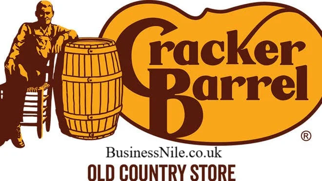
The old logo played a huge part in that emotional bond. It showed a friendly older man, known as Uncle Herschel, leaning against a barrel with the words Old Country Store underneath. That image has represented the brand since its earliest days.
What Is the Cracker Barrel New Logo
In August 2025, Cracker Barrel introduced a redesigned logo as part of a larger rebranding effort called All the More. The new design removed Uncle Herschel completely. It also dropped the barrel graphic.
What remained was a simple, clean wordmark showing only the words Cracker Barrel in a modern font. No character, no illustration, no barrel shape.
The company said the goal was a logo that felt fresh and worked well across digital screens, apps, and signage. On paper, that sounds like a smart move for a business trying to modernize. In practice, it did not land the way executives hoped.
Why Did Cracker Barrel Change Its Logo
Cracker Barrel had been working on a broader transformation strategy for about a year before the logo change, led by CEO Julie Masino. The company wanted to attract younger customers, refresh its restaurant interiors, and update its menu offerings.
The logo redesign fit into that bigger picture. According to the company, the new mark aimed to represent a more inclusive image of who visits Cracker Barrel today. On its website, the brand explained it wanted to celebrate the diversity of every guest instead of showing just one person.
In short, the change was not random. It was one piece of a business wide modernization push meant to keep Cracker Barrel relevant in a competitive dining market.
Old Logo Versus New Logo: What Actually Changed
Here is a quick side by side comparison so you can see exactly what shifted.
Old logo features:
- Illustration of Uncle Herschel sitting beside a barrel
- Rustic, handdrawn style
- Warm, nostalgic country store feel
- Words Old Country Store included
New logo features:
- Text only wordmark
- Clean, modern typography
- No human figure or illustration
- Simplified for digital and mobile use
The difference was not subtle. The new version stripped away almost every visual element that customers associated with the brand’s heritage. For a company built on nostalgia, that turned out to be a risky move.
The Purpose Behind the Rebrand
Modern branding often favors simplicity. Flat, minimal logos tend to scale better across apps, social media, and small screens. Many major companies have gone through similar simplification over the past decade.
Cracker Barrel likely hoped the new logo would signal growth and modern appeal while still keeping its core menu and restaurant charm intact. Paired with newly remodeled stores featuring brighter lighting and updated seating, the logo was meant to show the brand was evolving with the times.
The intention made sense from a corporate strategy standpoint. The execution, however, ran straight into the power of nostalgia.
Customer Reactions and the Public Backlash
This is where the story gets interesting. Within hours of the reveal, social media lit up with criticism. Long time customers felt the brand had erased a piece of its identity.
Some critics argued the redesign disconnected the company from its Southern roots. Others called the whole effort unnecessary, insisting the old logo never needed fixing in the first place.
The backlash was not just online noise either. Cracker Barrel’s stock value dropped by more than ten percent in the days following the announcement, wiping out close to one hundred million dollars in market value. That kind of financial reaction from Wall Street shows just how seriously investors took the public mood.
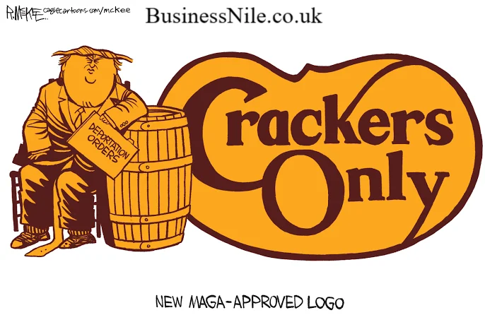
Even political figures weighed in. President Donald Trump publicly urged the company to bring back its original logo, saying the move would help the brand succeed again. That comment added even more attention to an already heated conversation.
Branding experts weighed in too, noting that people had built a mental picture of Cracker Barrel as something constant and comforting. When that picture suddenly changed, the emotional reaction was swift and strong.
The Role of Nostalgia in the Controversy
Nostalgia plays a massive role in how people connect with brands, especially ones tied to family memories and road trips. For many customers, the old logo was not just a picture. It represented childhood visits, family dinners, and a feeling of familiarity.
When a brand changes something tied that closely to memory, customers often feel like they are losing a piece of their own history, not just seeing a new design. That emotional weight is exactly why the Cracker Barrel new logo controversy grew so large so quickly.
Is the New Logo Still Being Used
No, it is not. After about one week of intense criticism, Cracker Barrel officially reversed its decision. The company announced through social media that the new logo was going away and that Uncle Herschel, referred to affectionately as the Old Timer, would remain part of the brand.
In its statement, Cracker Barrel thanked customers for sharing feedback and admitted it could have done a better job explaining the reasoning behind the change. The reversal happened fast, making this one of the quickest brand rollbacks in recent corporate history.
So if you are wondering whether the modern wordmark is still around in restaurants or on packaging today, the answer is simple. The classic logo with Uncle Herschel and the barrel is back and remains the official Cracker Barrel identity.
How the Logo Fits Into the Bigger Modernization Strategy
Even though the logo change failed, Cracker Barrel’s broader modernization plan has not disappeared. The company continues remodeling locations with updated interiors, refreshed lighting, and modern seating while keeping signature elements customers love, like stone fireplaces and classic décor pieces.
This shows an important lesson for any business. You can modernize operations, menus, and store layouts without necessarily touching the core visual identity that customers feel emotionally attached to. Cracker Barrel seems to be leaning into that lesson now, focusing on remodeling and menu updates while leaving the logo untouched.
Impact on Brand Recognition and Customer Loyalty
Brand recognition depends heavily on consistency. Customers build trust through familiar symbols, colors, and characters they see again and again. When Cracker Barrel removed Uncle Herschel, it briefly broke that consistency, and the market reaction proved how much that mattered.
The quick reversal actually helped protect long term loyalty. By listening to customer feedback and acting fast, Cracker Barrel avoided a longer lasting dip in trust. Many customers viewed the company’s willingness to admit a misstep and correct it as a positive sign, even amid the chaos.
Final Thoughts
The Cracker Barrel new logo saga proves one simple truth. Even small design choices can carry huge emotional weight when they touch something people consider timeless. Cracker Barrel tried to modernize its image, faced a wave of backlash, and chose to bring back the classic look customers know and love.
What do you think about the whole situation? Would you have kept the new design or brought back Uncle Herschel just like the company did? Feel free to share your thoughts, and if you found this breakdown helpful, pass it along to a fellow Cracker Barrel fan.
Frequently Asked Questions
Why did Cracker Barrel change its logo? Cracker Barrel changed its logo as part of a wider rebranding effort called All the More. The company wanted a cleaner, more modern mark that worked better across digital platforms and represented a broader range of guests.
What changed in the new logo? The new logo removed the illustration of Uncle Herschel and the barrel graphic. It kept only the words Cracker Barrel in a simplified, modern font, with no character or rustic design element.
Why did customers dislike the redesign? Many customers felt the new logo erased the brand’s Southern heritage and nostalgic charm. The old logo represented decades of family memories, so removing it felt like a loss of identity rather than a simple design update.
Is the old logo coming back? Yes, the old logo already returned. Cracker Barrel reversed its decision within about a week and confirmed that Uncle Herschel and the classic barrel design would remain part of the brand permanently.
Is the new logo official in 2026? No, the new logo is not official. Cracker Barrel scrapped the redesign back in August 2025 and has continued using its traditional logo with Uncle Herschel ever since.
Did the logo change affect Cracker Barrel’s stock price? Yes, it did. Shares dropped more than ten percent following the announcement, and the company lost close to one hundred million dollars in market value before reversing the decision.
Does Cracker Barrel still plan to modernize its stores? Yes, the company continues updating restaurant interiors with fresh lighting and seating while preserving beloved features like fireplaces and classic décor, separate from the logo itself.
Who is Uncle Herschel in the Cracker Barrel logo? Uncle Herschel is the illustrated figure shown sitting beside a barrel in the classic Cracker Barrel logo. He represents the uncle of the company’s founder and has been part of the brand since its early years.
BusinessNile.co.uk
Email: johanharwen314@gmail.com
Author Name: Hamid Ali