The Iconic and Powerful Lockheed Martin Logo: Everything You Need to Know in 2026
Introduction
When you see the Lockheed Martin logo, you instantly feel the weight of history behind it. It is not just a corporate badge. It is a symbol that represents more than seven decades of aerospace engineering, national defense, and human ambition. Whether you are a design enthusiast, a branding professional, or simply someone curious about one of the world’s most powerful defense contractors, the story of this logo has something for you.
The Lockheed Martin logo is one of the most recognized brand marks in the aerospace and defense industry. It carries decades of meaning, strategy, and visual precision. In this article, you will learn about its history, design evolution, color psychology, and what makes it stand out from every other corporate logo in the world.
By the end, you will have a clear picture of why this logo works so well and what design lessons you can take from it. Let us dive in.
A Brief History of Lockheed Martin and Its Brand Identity
Lockheed Martin was born in 1995 when Lockheed Corporation and Martin Marietta merged to form one of the largest defense contractors in the world. But the roots of each company stretch back much further. The Lockheed brothers founded their aviation company in 1912. Martin Marietta had its own rich history going back to Glenn L. Martin, who built his first aircraft in the early 1900s.
When these two giants merged, they needed a logo that could carry both legacies forward. The result was the Lockheed Martin logo we recognize today. It had to speak to governments, militaries, and shareholders across the globe. That is no easy task for a single visual mark.
Today, Lockheed Martin operates in five major business segments: Aeronautics, Missiles and Fire Control, Rotary and Mission Systems, Space, and Sikorsky. Each division carries the parent brand identity. The logo unifies all of them under one powerful visual umbrella.
Breaking Down the Lockheed Martin Logo Design
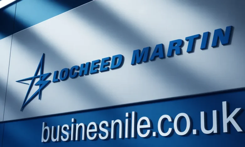
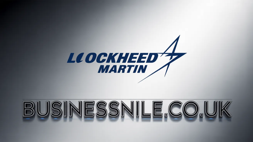
The Lockheed Martin logo is clean, bold, and unmistakable. At its core, it uses a combination of a triangular star symbol and a clean wordmark. Every element has a purpose. Nothing is accidental. Let us break it down piece by piece.
The Star Symbol
The most distinctive element of the Lockheed Martin logo is its star-shaped emblem. The star is composed of triangular shapes that form a bold geometric figure. This design choice is deliberate. Stars carry universal meaning: excellence, aspiration, and national pride. For a company that builds fighter jets, missiles, and spacecraft, a star is the perfect anchor.
The triangular elements within the star also suggest speed, precision, and forward movement. Triangles are one of the most structurally sound shapes in engineering, and using them in a logo sends a subtle but powerful message about the company’s engineering excellence.
The Wordmark: Clean and Authoritative
Next to the star sits the company name in a clean, sans-serif typeface. The typography is straightforward and highly legible. There are no fancy flourishes or decorative elements. This is intentional. When you serve clients that include the U.S. Department of Defense and NASA, you want your brand to project confidence and reliability, not creativity for its own sake.
The letterforms are solid and evenly spaced. The text does not try to compete with the star emblem. Instead, the two elements work together in perfect visual balance. The wordmark is strong enough to stand alone, but it is most powerful when paired with the star.
The Color Psychology Behind the Lockheed Martin Logo
Color is one of the most powerful tools in branding. The Lockheed Martin logo uses a deep, dark blue as its primary color. This is not a coincidence. Blue is the most trusted color in corporate design. Studies show that blue increases feelings of security and reliability. For a defense contractor, those are exactly the emotions you want to trigger.
The dark shade of blue also communicates authority and sophistication. It feels premium without being flashy. It is the kind of blue you see on the uniforms of law enforcement, on the flag of the United States, and on the badges of institutions that people trust with their lives.
White is used as a secondary color in the logo, providing contrast and clarity. White adds a sense of cleanliness and precision. Together, blue and white create a visual language that says: we are serious, we are capable, and we are trustworthy.
Here is a quick summary of the color meanings in the Lockheed Martin logo:
- Dark Blue: Trust, authority, reliability, and national pride
- White: Precision, clarity, and cleanliness
- The combination: Institutional strength and technological leadership
How the Lockheed Martin Logo Has Evolved Over Time
The Lockheed Martin logo has not changed dramatically since the company was formed in 1995. That kind of consistency is rare in the corporate world. Most major brands refresh their logos every decade or so. Lockheed Martin has stayed remarkably true to its original visual identity. Why? Because stability matters in their industry.
Before the merger, Lockheed had its own logo featuring the name in a bold, spaced typeface. Martin Marietta used a different visual identity with its own color schemes and symbols. When the two companies merged, the branding team had to make a critical decision: blend both identities or start fresh.
They chose to create something new that honored both legacies. The star motif became the unifying element, connecting both the Lockheed heritage of aviation excellence and the Martin tradition of space and missile systems. It was a smart move that has stood the test of time.
Over the years, the logo has seen minor refinements in font weight and proportions, but the core design has remained consistent. This consistency reinforces the brand’s message of stability and long-term commitment.
What Makes the Lockheed Martin Logo Stand Out from Competitors
The defense and aerospace industry is full of strong logos. Think of Raytheon, Boeing, Northrop Grumman, and General Dynamics. Each of these companies invests heavily in their brand identity. So what makes the Lockheed Martin logo different?
Here are the key differentiators:
- Simplicity with depth: The logo looks simple at a glance but carries layers of meaning.
- Timelessness: It does not rely on design trends that go out of style.
- Scalability: The logo works perfectly on everything from a business card to the side of an aircraft.
- Symbolism: The star is universal and aspirational, crossing cultural and national boundaries.
- Consistency: The brand has remained largely unchanged for nearly three decades.
How Lockheed Martin Uses Its Logo Across Platforms
A great logo is versatile. The Lockheed Martin logo appears on aircraft, rockets, missiles, corporate documents, military contracts, trade show booths, websites, social media profiles, employee uniforms, and branded merchandise. In every context, it delivers the same message: precision and power.
On digital platforms, the logo scales beautifully. The icon version, featuring just the star, works as a favicon or app icon. The full wordmark appears on the company website and in official documents. This flexibility is a sign of excellent logo design.
The brand guidelines for the Lockheed Martin logo are strict. The company does not allow unauthorized use of the logo. If you want to use it for editorial or educational purposes, you need to be careful about how you handle it. The logo is a registered trademark and is protected under intellectual property law.
Design Lessons You Can Learn from the Lockheed Martin Logo
Even if you are not designing for an aerospace company, there is a lot you can learn from studying the Lockheed Martin logo. Here are some takeaways that apply to any branding project.
1. Use Symbols That Carry Meaning
The star in the Lockheed Martin logo is not just decorative. It connects to ideas of excellence, ambition, and national identity. When you design a logo, choose symbols that genuinely connect to what your brand stands for. Avoid random shapes that look cool but say nothing.
2. Keep It Simple
The best logos are almost always simple. You should be able to draw the Lockheed Martin logo from memory after seeing it a few times. Complexity is the enemy of memorability. Strip away anything that is not essential.
3. Choose Colors Intentionally
Every color in your logo sends a message. The Lockheed Martin logo uses blue and white because those colors communicate the right emotions for the brand. Before you pick a color palette, ask yourself what feelings you want your logo to trigger in the viewer.
4. Design for Longevity
The Lockheed Martin logo has stayed relevant for nearly thirty years. That tells you it was designed to last. Avoid chasing trends. A logo that looks dated in five years is a liability. Design for decades, not for the current season.
5. Balance Your Elements
Notice how the star and the wordmark in the Lockheed Martin logo do not compete with each other. They work together. Good logo design is about visual harmony. Make sure all your elements support each other rather than fighting for attention.
The Lockheed Martin Logo and Global Brand Recognition
Lockheed Martin is not just an American company. It operates in more than 50 countries and serves clients from NATO allies to space agencies around the world. The Lockheed Martin logo has to work across languages, cultures, and contexts. That is a tall order.
The fact that the logo achieves this is a testament to the power of good visual design. You do not need to speak English to understand what the Lockheed Martin logo communicates. The star symbol, the bold typography, and the confident color scheme all speak a universal language.
According to Fortune 500 data, Lockheed Martin consistently ranks among the top 60 companies by revenue. The brand recognition that comes with the Lockheed Martin logo plays a real role in the company’s ability to win contracts, attract talent, and build partnerships globally.
What the Lockheed Martin Logo Means to Employees and Partners
Brand identity is not just for customers. It matters deeply to the people who work inside the organization. When employees see the Lockheed Martin logo on their badge, their building, their products, and their paychecks, it sends a message: you are part of something bigger than yourself.
Lockheed Martin employs more than 110,000 people worldwide. Many of them work on classified projects. They cannot talk about what they do, but the logo they wear tells the world they are working on things that matter. That is a powerful form of identity.
For partners and suppliers, the Lockheed Martin logo signals reliability and quality standards. If your product ends up on a Lockheed Martin platform, you have passed an extremely rigorous quality review. The logo is a stamp of approval that carries weight throughout the entire supply chain.
Common Misconceptions About the Lockheed Martin Logo
People sometimes confuse the Lockheed Martin logo with logos from other defense contractors. Here are a few things that are worth clearing up.
- It is not a plain star: The star in the logo is a custom geometric design, not a standard five-pointed star.
- It is not public domain: Despite being widely recognizable, the Lockheed Martin logo is a protected trademark.
- It did not come from either original company: The current logo was created specifically for the merged entity in 1995.
- It is not just used in the U.S.: The logo appears on products, programs, and facilities in dozens of countries.
Conclusion: Why the Lockheed Martin Logo Gets It Right
The Lockheed Martin logo is a masterclass in strategic branding. It is simple, meaningful, consistent, and versatile. It works on a fighter jet and on a business card. It communicates trust, ambition, and technical excellence all at once. And it has done so for nearly three decades without needing a major overhaul.
If you are studying branding, working in design, or simply curious about how the best companies present themselves to the world, the Lockheed Martin logo offers lessons that go far beyond aerospace. It shows you what happens when a company takes its visual identity seriously.
What do you think makes a great corporate logo? Does the Lockheed Martin logo earn its reputation? Share your thoughts, or pass this article along to someone who loves branding and design.
Frequently Asked Questions (FAQs)
1. What does the Lockheed Martin logo represent?
The Lockheed Martin logo represents the company’s identity as a global leader in aerospace, defense, and technology. The star symbol reflects excellence and national pride, while the bold wordmark conveys authority and reliability.
2. When was the Lockheed Martin logo created?
The current Lockheed Martin logo was created in 1995 when Lockheed Corporation and Martin Marietta merged. The logo was designed to represent the new combined entity rather than either predecessor company.
3. What colors are used in the Lockheed Martin logo?
The primary color in the Lockheed Martin logo is a deep, dark blue, often paired with white for contrast. These colors communicate trust, precision, and institutional authority.
4. Can I use the Lockheed Martin logo on my website?
No. The Lockheed Martin logo is a registered trademark. You cannot use it commercially without explicit permission from the company. Limited editorial or educational use may be permissible, but you should consult a legal professional before using it.
5. Has the Lockheed Martin logo ever changed?
The core design of the Lockheed Martin logo has stayed consistent since 1995. There have been minor refinements in proportions and font weight, but the fundamental design, including the star symbol and blue color scheme, has remained the same.
6. What font does the Lockheed Martin logo use?
The Lockheed Martin logo uses a custom or proprietary sans-serif typeface. The font is clean, bold, and highly legible. It was chosen specifically for the brand and is not a standard commercial font that you can download freely.
7. Why does the Lockheed Martin logo use a star?
The star in the Lockheed Martin logo carries universal meaning. It symbolizes excellence, ambition, and aspiration. For a company whose products literally go to the stars, the star symbol is both literal and symbolic.
8. How does the Lockheed Martin logo compare to Boeing’s logo?
Both logos use blue and project authority. Boeing’s logo is more typographic and uses a stylized wing symbol. The Lockheed Martin logo uses a more geometric star mark. Both are strong, but the Lockheed Martin logo feels more abstract and versatile across contexts.
9. Is the Lockheed Martin logo trademarked?
Yes. The Lockheed Martin logo is a registered trademark of Lockheed Martin Corporation. Using it without authorization for commercial purposes is a legal violation.
10. What design lessons can small businesses learn from the Lockheed Martin logo?
Small businesses can learn a lot from the Lockheed Martin logo. The key lessons are: keep your design simple, use colors intentionally, choose symbols that reflect your values, and design for longevity rather than trends.
Also Read In BusinessNile.co.uk
Email: johanharwen314@gmail.com
Author Name: Hamid Ali
About the Author: Hamid Ali is a branding strategist and content writer with over a decade of experience covering corporate identity, logo design, and visual communication. He has written extensively for marketing publications and design blogs, helping businesses of all sizes understand the power of strong brand identity. Hamid holds a degree in Graphic Design and has consulted for companies across the technology, defense, and consumer goods sectors. When he is not writing about brands, he is studying the visual language of the world’s most successful companies.